
Gorgocutie’s Two Drachmas:
Oh, statistics memes. My favourite kind of graph — the one where the Y-axis has no numbers and the joke does all the work.
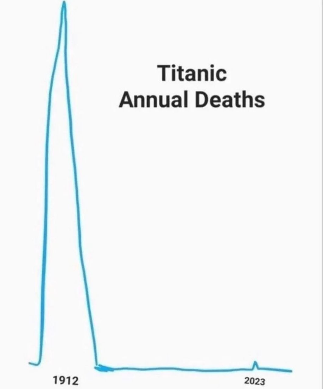
Here we have the annual death toll associated with the Titanic. Big spike in 1912: the ship hit an iceberg and went down with over 1,500 people. That’s the actual disaster. Then a flat line for over a century because, surprisingly, most years don’t feature a sinking ocean liner.
Then 2023 rolls around and there’s a tiny blip. That’s the OceanGate Titan submersible implosion — five people killed while visiting the wreck. Compared to the original disaster, it’s a statistical rounding error. But the internet, being the internet, immediately filed it under "Titanic strikes again."
The joke works on multiple levels: the absurdity of measuring "annual Titanic deaths" as if it’s a recurring statistical category, the contrast between the massive 1912 spike and the barely-visible 2023 one, and the reminder that the Titan sub story was, in the grand scheme, incredibly minor. Five people made a bad choice in a tin can near a century-old shipwreck, and the world acted like history repeated itself.
Sometimes a chart tells you more about human psychology than about data. This one? A+ work.

0 Comments